In this article we will discuss about the fundamental and technical analysis of a company.
Fundamental Analysis:
The fundamental analysis suggests that every stock has an intrinsic value, which should be equal to the present value of the future stream of income from the stock discounted at an appropriate risk related rate of interest. Fundamental analysis tries to value the underlying factors in a business and estimate the intrinsic value of a security.
Fundamental analysis is all about doing qualitative and quantitative analysis about basic details of the business such as the revenue, expenses, assets, liabilities and all other fundamental aspects of the company. Estimate of real worth of a stock is made by considering the earning potential of a company, which depends on investment environment and factors relating to specific industry, competitiveness, quality of management, operational efficiency, profitability, capital structure and dividend policy.
Fundamental analysts assume for the purpose of valuation that a share’s current intrinsic value must be calculated not on its potential capital gain, but on the total future return for which an investor holds the share for good. Thus, a share’s true value ‘discounts’ its future earnings, that is, it takes into account the present worth of all those anticipated earnings.
ADVERTISEMENTS:
As the approach is based on relevant factors like economic climate and trends in financial markets, it generally gives more realistic estimate of the value of a stock. The fundamental analysis is helpful in establishing basic standards, but cannot be totally relied because of the uncertainties associated with the economic and market factors. The analysis of the following will reveal the intrinsic value of stocks.
Categories of Fundamental Analysis:
The fundamentals of a company can be grouped into two categories:
(a) Quantitative analysis, and
(b) Qualitative analysis.
ADVERTISEMENTS:
(a) Quantitative Analysis:
The quantitative analysis is based on numerical terms and factors like operational efficiency, profitability, capital structure and dividend policy. The quantitative factors are those which can be obtained from the financial statements. The factors like revenue, expenses, profit, deferred revenue, capital structure, working capital, deferred revenue etc.
(b) Qualitative Analysis:
The qualitative fundamentals involve the nature of industry, investment environment, factors relating to specific industry, competitiveness, quality of management, corporate governance etc. The basic objective of making investment in stock is to obtain higher returns by selling the stocks at higher prices subsequently.
ADVERTISEMENTS:
The positive change in price of stocks and income in the form of dividends and interest is expected by the investor to invest his funds in the stocks. The returns on the stock will be influenced by the external factors. The securities analyst must analyze the economic factors and the industry performance to forecast the earnings on investments.
The qualitative factors that affect the fundamentals and earning capacity value of the company are discussed briefly as follows:
I. Macro-Economic Analysis:
The analysis of the following factors indicates the trends in macro-economic changes that effect the risk and return on investments:
ADVERTISEMENTS:
1. Money supply
2. Industrial production
3. Capacity utilization
4. Unemployment
ADVERTISEMENTS:
5. Inflation
6. Growth in GDP
7. Institutional lending
8. Stock prices
ADVERTISEMENTS:
9. Monsoons
10. Productivity of factors of production
11. Fiscal deficit
12. Credit/Deposit ratio
ADVERTISEMENTS:
13. Stock of food grains and essential commodities
14. Industrial wages
15. Foreign trade and balance of payments position
16. Status of political and economic stability
17. Industrial wages
18. Technological Innovations
ADVERTISEMENTS:
19. Infrastructure facilities
20. Economic & industrial policies of the government
21. Debt recovery and loans outstanding
22. Interest rates
23. Cost of living index
24. Foreign investments
ADVERTISEMENTS:
25. Trends in capital market
26. Stage of the business cycle
27. Foreign exchange reserves.
II. Industry Analysis:
The securities analyst will take into consideration the following factors into account in assessing the industry potential in making investments:
1. Post sales and earnings performance
ADVERTISEMENTS:
2. Government’s attitude towards industry
3. Labour conditions
4. Competitive conditions
5. Performance of the industry
6. Industry share prices relative to industry earnings
7. Stage of the industry life cycle
ADVERTISEMENTS:
8. Industry trade cycle
9. Inventories buildup in the industry
10. Investors preference over the industry
11. Technological innovations
12. Return on capital employed
13. Critical cost component
ADVERTISEMENTS:
14. Availability of skilled manpower
15. Constant innovation
16. Supply side constraints
17. Commoditized products
18. Regulatory constraints
19. Growing domestic demand
20. Expanding export market
21. Macro trends
Other Aspects of Fundamental Analysis:
The other important aspects of fundamental analysis are as follows:
1. Competitive Advantage:
The competitive advantage for an organization means discovering the needs of the customers and then satisfying them by having a technological development in competitive environment.
2. Competitive Position:
The competitive position is the basic determinant of future profits and of the business value. Knowledge of relative costs and market share of important players in the industry is an important aspect of the company’s competitive position. The evaluation of enterprise’s comparative advantages or value added, relative to competitive firms is the major determinant of the company’s worth.
3. Corporate Governance:
The policy of corporate governance adopted in an enterprise stipulates parameters of accountability, control and reporting functions of the Board of Directors. It is concerned with the establishment of a system whereby the directors are entrusted with responsibilities and duties in relation to the direction of corporate affairs.
4. Company’s Intangibles:
The fundamental analysis takes into consideration the various intangibles of the company like brand image, cost advantage, technological development, investor friendly policies, human resource development and loyalty etc. which play a strong influence on the value of stock price of the company.
5. Efficiency of Management:
The capability and efficiency of the management who are in the control of affairs of the company will have a vital impact on the share price, since the management decision will make the company to get killed or win in the competitive business situations. The financial news dailies analysis will help in evaluation of management of a particular company.
6. Timely Information and Transparency:
The timeliness and transparency in the information provided by the company help in deciding the security of the company in establishing a relation with its stakeholders.
7. Structure of the Board of Directors:
The balanced structure of the board of directors which represents, finance, accounting, technical, human resources, marketing, production, special advisors will win the confidence of the investing public.
Fundamental analysis provides a more in-depth and fundamental measure of stocks from a long-term perspective by studying their fundamental parameters. Analysts perform fundamental analysis since it is largely believed that stock price does not reflect the value of the company. This true value or the intrinsic value can be estimated only through the fundamental analysis.
Technical Analysis:
The underlying assumption of technical analysis is that the price of a stock depends on supply and demand in the market place. It has little co-relation with its intrinsic value. All financial data and market information of a given stock is already reflected in its market price. As such, charts are drawn to identify price movement pattern to predict future movement of the stock. The technical analyst will use the following approaches in analysis of securities.
The field of technical analysis is based on three assumptions:
1. Market Discounts Everything:
Technical analysis assumes that, at any given point in time, a security’s price incorporates all the factors that can impact the price including the fundamental factors. Technical analysts believe that the company’s fundamentals, along with broader economic factors and market psychology are all built into the security price and therefore there is no need to study these factors separately. Thus the analysis is confined to an analysis of the price movement. Technical analysis considers the market value of a security to be solely determined by supply and demand.
2. Price Moves in Trends:
Technical analysis believes that the security prices tend to move in trends that persist for long periods of time. This means that after a trend has been established, the future price movement is more likely to be in the same direction as the trend than to be against it. Any shifts in supply and demand cause reversals in trends. These shifts can be detected in charts/graphs.
3. History Tends to Repeat Itself:
History tends to repeat itself, mainly in terms of price movements. Many chart patterns tend to repeat themselves. Market psychology is considered to be the reason behind the repetitive nature of price movements; market participants react in a consistent manner to similar market stimuli over a period of time.
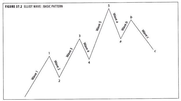
Elliot Wave Analysis of Technical Analysis:
Ralph Elliot was an accountant who developed his theory on market cycles in 1939. Some believe his theory is based on an ancient Japanese trading method. Basically, Elliot believed there is a ‘natural order’ to the markets and they travel in predictable cycles. He believed the stock market (and the theorists say this can be transferred to commodities) rallies in five waves when in an uptrend, and falls in three wave corrective moves.
When in a downtrend the main trend is five waves down with three wave corrective up moves. This five wave pattern is made- up of three odd numbered waves, 1, 3, and 5 which are connected by two corrective waves, 2 and 4. Each major odd-numbered wave can also be sub-divided into five waves, and corrective waves can be broken into three parts (the abc correction).
Chartism:
Chart patterns are used to predict the market movements.
The basic concepts underlying the chart analysis are:
(a) Persistence of trends,
(b) Relationship between volume and trend, and
(c) Resistance and support levels.
The chartists believe that stock prices move in a fairly persistent trend. There is an in built inertia the price movement continues along a certain path (up, down or sideways) until it meets an opposing force due to supply demand changes. Chartists also believe that generally volume and trend go hand-in-hand. When a major uptrend begins, the volume of trading increases and so also the price and vice versa.
Basically, the technical theory attempts to predict whether a trend is discernible, and, if so, predict whether it will continue or reverse. It may be pointed out that mood of investors vary unpredictably and so excessive reliance on technical indicators can be hazardous for investors. Past share prices may or may not predict their future behaviour. At best, share price movements, coupled with historical data, may help in predicting probabilities, but not the exact course of future events.
Most analysts use charts at times as a method of keeping track on the price movements of particular shares, or of the market as a whole. In the case of individual shares, charts can alert the analyst to any sharp upward or downward movement or any persistent trend relative to the market, and he or she may then decide to investigate the fundamentals of the company.
Chartists are a special breed, however, in that they rely on charts alone, and have their own ways of plotting share prices. The essence of chartism is the belief that share prices trace out patterns over time. These are a reflection of investor behaviour and, it can be assumed that history tends to repeat itself in the stock market, a certain pattern of activity that in the past produced certain results is likely to give rise to the same outcome should it reappear in the future.
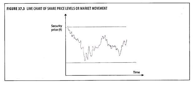
Line Charting:
The simplest form of chart is a line chart (see figure 37.3). This consists of a line connecting the closing prices of the share, or average prices over a period, perhaps a week, to show the price movements over a period of months or, more probably years. Those analysts who use line charts usually plot other lines on the same chart.
These may show the movement of the share price relative to an index for the appropriate market sector or for the market as a whole. They may also show the price movement relative to earnings or, with investment trusts, the price as a % of asset value.
Trend:
Every stock trades with a consistent direction in prices called a ‘trend’. A rising trend is characterised by higher lows and highs. In other words, a consistently rising support level. The opposite holds good for a falling trend. Joining the lows in a rising trend and highs in a falling trend, helps one draw a trend line. A breakout, penetrating the trend line, accompanied with higher volumes, indicates a reversal of the trend. Much like breakout of a resistance and supports, the trend line penetration signals fresh entry or exit points.
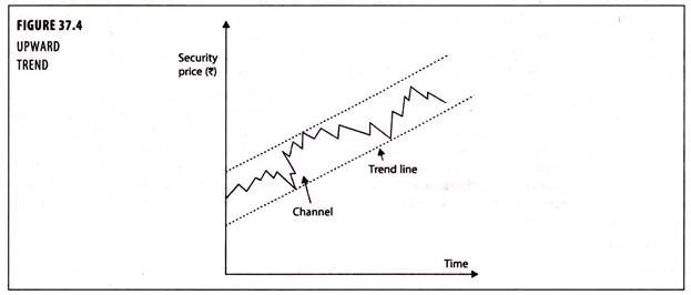
Up Trend and Down Trend:
A trend can be defined as the direction in which the market is moving. Uptrend is the upward movement and downtrend is the downward movement of a stock’s price or of the market as measured by an average or index over a period of time, usually longer than six months. If the succession of highs (peaks) and lows (troughs) occurs at increasingly higher prices, then the market is clearly in an uptrend as shown in figure 37.4. This trend is bullish indicating a good time to buy securities.
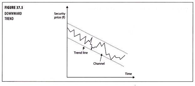
If the peaks and troughs occur at successively lower prices as shown in figure 37.5, the market is in down trend, which signals to the time to sell securities.
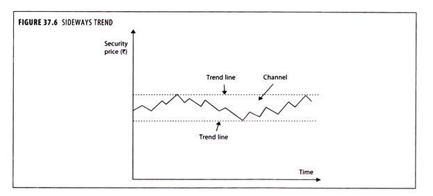
Side Ways Trend:
A side ways trend is characterized by stock prices trading in a range where successive peak occurs at the same level and successive troughs occur at the same level as shown in figure 37.6. The two levels create parallel horizontal trend lines. During this time investors should be extra careful and wait for more definite indicators of the future market movement. By drawing another line parallel to the trend line, a channel is created which can supposedly be used for predicting the extent of minor rallies and falls.
A trend line is a line joining at least two points (often three or more). Advances or declines sometimes appear to be composed of a series of ripples around a straight line. Chartists reckon that in a rising market the trend line is likely to be the one connecting the minor bottoms (figure 37.5) and in a declining market the one connecting the tops of the minor rallies.
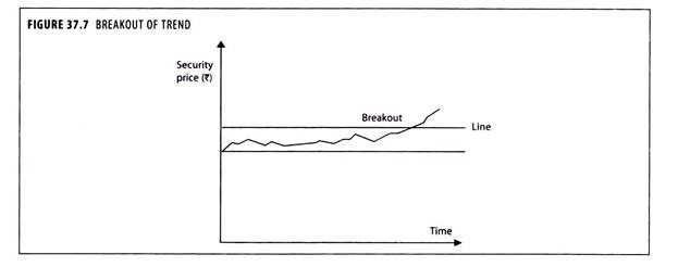
Break-Out of Trend:
A line (figure 37.7) is a period of consolidation, when the share price moves sideways within a range of about 5% of the share price. Eventually a break-out will occur, and it is often suggested that the longer the period of consolidation, the greater will be the extent of the ultimate rise or fall. Now, if the stock price penetrates a ‘support’ or a ‘resistance’, that means that the general consensus on what the price should be has changed.
This is known as a ‘breakout’. It can be the result of a fundamental change in the stock, and is usually abrupt in nature. Again, one must see it in conjunction with recent increment in volume, signifying a mass change on the consensus about the new prices levels. Once a resistance is crossed convincingly, it becomes a significant support and once a support is penetrated strongly, it turns into a resistance.
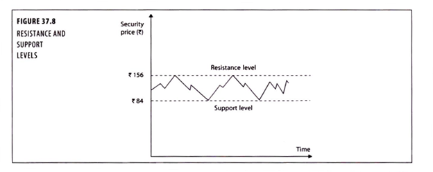
Resistance and Support Levels:
Every stock price is the result of an ongoing tussle between buyers and sellers. Not all traders agree upon the prevailing prices, hence the constant movement. But there comes a level when a seller is unwilling to sell and the buyer feels the prices can’t go down further. This is labelled as the ‘support’ level. At this level, buyers will come in to buy the stock and even sellers with a bearish view may not see the price falling further.
A similar agreement on overheated prices between buyers and sellers creates a hurdle or ‘resistance’ for the stock price from going up. These levels are vivid and recurrent. The stock price falls to a particular point and bounces back taking support. At ‘resistance’ points, stocks hit a barrier, restricting further rise.
Head and Shoulders Pattern:
The head and shoulders pattern as shown in figure 37.9 indicates the reversal of an uptrend. Here the share price rises on buying pressure from investors who have specialist knowledge of the company.
The formation begins with a price advance (A) Which is supported by a high volume of trading. This causes a pause or slight decline (B) This is later reinforced by other investors jumping on the bandwagon. Then the price advances to a higher level (C) But supported by lighter trading volume. The price decline to (D) This pause is then followed by a rally to a lower peak (E) Than the previous one (C) But still on decreasing volume.

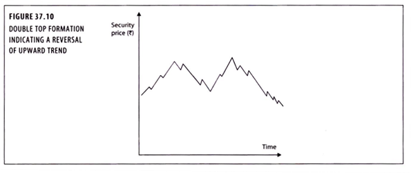
Double Top Formation:
The double top occurs (figure 37.10) as an uptrend is about to reverse itself.
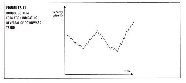
Double Bottom Formation:
In the double bottom (figure 37.11), the second decline is supported by substantially more volume, indicating the price about to rise.
Distribution Patterns:
If proportionate price changes are randomly generated events, then their distribution should be approximately normal. It is based on the rule of statistics that the sum of the distribution of random occurrences will conform to a normal distribution. It is shown in figure 37.12.
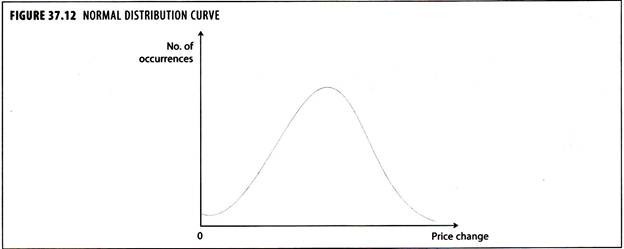
When such a test was conducted, only very slight deviations from normality were noted.
Japanese Candlestick Charting:
The Japanese Candlestick, invented by the Japanese more than a century ago, is basically a visual representation of the price bar, showing the open, high, low and the closing price of a period. Very much like the Bar charting, Japanese candlestick charting, not only shows the closing price of the stock during a period, but also captures the range of price movement during that period, as also the period’s opening price.
The candlestick charts can be of a one-day period or a longer period like a week or a month. In Japanese candlestick, the box shows the opening and the closing price of a period, whereas the ‘wick’ shows the lowest and the highest price of the period.
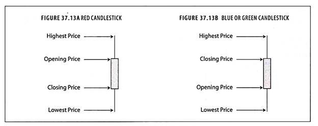
These are very similar to bar charts, except that colours are used, which give a greater detail in movements within the period at a glance. Each period is represented by a candlestick which consists of a body and a wick at both ends. The candle body is coloured (typically red and either blue or green). The wick represents the high and low of the period and the body of the candle represents the open and close of the period.
Colour of the candlestick lets us know whether the price rose or fell in that period. If the close is higher than the open-the candlestick is shaded blue/ green. If the open is higher than the close-the candlestick is shaded red. Thus with a red colour candlestick, the top of the candle represent the opening price and the bottom indicates the closing price.
A green or blue candle represents the opposite of this situation: the top of the candle is the closing price while the bottom is the opening price. The advantage of candlestick charts is that it presents itself as an immediately recognizable visual form of the price pattern, and highlights the actions of buyers and sellers in a much better way during a period of time.
Filter Rules:
Filters are designed to isolate the primary trends from minor price changes arising from random factors. Figure 37.14 illustrates their use. If the price of a share moves up at least ‘x’ per cent from a low point, it should be bought and held until its price moves down at least ‘x’ per cent from a subsequent high, at which time it should be sold. The share is not repurchased until it moves up against at least ‘x’ per cent from the subsequent low point.
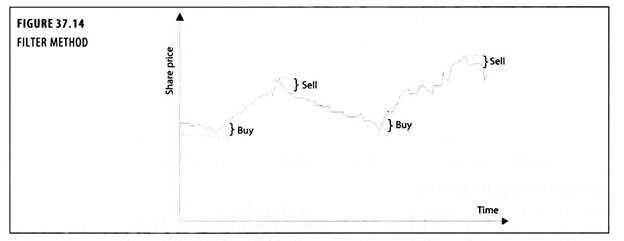
The problem with using this technique is deciding on the size of the filter. If ‘x’ is small (3 to 5 per cent, say), the investor is constantly buying and selling and thus spending heavily on broker/dealer’s commission and stamp duty. If ‘x’ is large (perhaps 20 to 25 per cent), much of the price movement has taken place before the investor acts. The so-called ‘hatch system’ is basically a 10 per cent filter.
Moving Average:
The moving average is a lagging indicator which is easy to construct and is one of the most widely used. A moving average, as the name suggests, represents an average of a certain series of data that moves through time. The most common way to calculate the moving average is to work from the last 10 days of closing prices. Each day, the most recent close (day 11) is added to the total and the oldest close (day 1) is subtracted.
The new total is then divided by the total number of days (10) and the resultant average is computed. The purpose of the moving average is to track the progress of a trend. The moving average is a smoothing device. By averaging the data, a smoother line is produced, making it much easier to view the underlying trend. A moving average filters out random noise and offers a smoother perspective of the price action.
Problem 1:
The closing price of the stock of Very fine Ltd. at the stock exchange for 10 successive days was as follows:

Solution:
Calculation of 7 day Moving average:
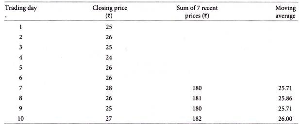
You are required to calculate a 7 day moving average of stock price of the company and comment on its short-term trend.
Comment:
The 7 day moving average is used by technical analysts in estimating the trend of the security market or price of a particular security. The trend indicates the bearish or bullish phase. The above data indicates the bearish trend of the stock price of Very fine Ltd., based on the closing prices of past 10 days. But a wider period’s data can tend to make accurate prediction.
Moving Average Convergence-Divergence (MACD):
MACD is a momentum indicator and it is made up of two exponential moving averages. The MACD indicator is primarily used to trade trends and should not be used in a ranging market. Signals are taken when MACD crosses its signal line, calculated as a 9-day exponential moving average of MACD.
It can be displayed as two lines representing the oscillator and its moving average or as a histogram showing the difference between the oscillator and its moving average. A buy signal is given when the MACD graph is in an oversold condition below the origin and the MACD line crosses above the signal line. A sell signal (negative breakout) is given when the MACD graph is in an overbought condition above the origin and the MACD line falls below the signal line.
The important crossovers of the MACD line to the signal line occur far from the zero line (the horizontal axis). The amount of divergence between the MACD line and the signal line is important, the greater divergence the stronger the signal. Traders use the MACD for indicating trend reversals. This indicator measures short-term momentum as compared to longer term momentum and signals the current direction of momentum.
Stochastics Oscillator:
Stochastics are another popular oscillator, developed by George Lane and also available on most software programs. The stochastics formula is a bit more complex than RSI, and readily available for those who want to see the mathematics. What the formula does is to measure how the close impacts the trend.
The theory is, in bull markets the close will more likely be near the day’s high, and in bear markets the close will more likely be near the day’s lows. The way the market closes will determine how the stochastic trends. In essence, stochastics are a measurement of how the most current close relates to where prices have been during the period under study.
Stochastics consist of two lines, the %K, which is more sensitive, and the %D which is slower moving. Like the RSI, the trader can choose the number of days for the formula. Shorter term (5 days is popular) are very sensitive, will act quickly, but lead to many more whipsaws. Longer term (14 days is widely used) identify longer term moves and eliminate some of the whipsaws of the shorter variety.
If you plan to work with stochastics, the computer will plot the ‘fast’ stochastic and the ‘slow’ version. The slow is a better way to go, since it is smoothed to eliminate many of the whipsaw and false signals of the former.
The stochastic’s values will range between 0 and 100, just like the RSI, and overbought is generally considered to be a value in excess of 80, oversold less than 20. They can be used like the RSI this way, but they tend to give better signals when they diverge from price (just like the RSI). Divergence can precede the market. Bullish divergence is when prices hit new lows, but the stochastic makes a higher low than its previous low.
Bearish divergence is when prices hit a new high, but the stochastic makes a lower high. Both of these occurrences can give strong indications of market tops and bottoms. Traders also look for the stochastic lines to cross to exit an existing position or enter a new one. The best signals come when divergence is present, and then the %K line crosses the %D line which confirms the divergence.
Relative Strength Index (RSI):
The relative strength index (RSI) is another of the well-known momentum indicators. Momentum measures the rate of change of prices by continually taking price differences for a fixed time interval. RSI helps to signal overbought and oversold conditions in a security. RSI is plotted in a range of 0-100.
A reading above 70 suggests that a security is overbought, while a reading below 30 suggests that it is oversold. This indicator helps traders to identify whether a security’s price has been unreasonably pushed to its current levels and whether a reversal may be on the way.
There’s a group of technical indicators called ‘oscillators’. They work in a similar manner and are popular with traders as overbought or oversold indicators. The most commonly used is the Relative Strength Index (RSI). It was originally developed by Welles Wilder in the late 1970s. Markets do not go straight up or straight down forever without corrective moves. There comes a point where the market is ready to turn, either temporarily or for good.
Overbought basically means the market is too high in the respect that it’s running out of buyers, in effect about to fall of its own weight. Oversold is the antonym. The market is too low, running out of sellers (atleast for the current time period) and ready for a bounce. The RSI attempts to quantify the degree of oversoldness or overboughtness.
For you mathematicians, the formula is as follows:
Example:
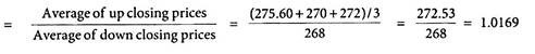
RSI = 100 – (100/[1+ RS])
Where, RS = Average of net up closing changes for N days/Average of net down closing changes for N days
The number of days is selected by the trader, 9 is the standard or ‘default’ in most programs. To calculate the 9-day RSI you would need to average the change of the previous 9 up days, and divide this number by the average of the change of the previous 9 down days. Just about all the technical software programs, and many commodity brokers, will calculate the daily RSI for you.
The RSI will range from just above 0 to just under 100, but it is extremely rare to see a number close to either of these extremes. The RSI spends most of its time fluctuating between 30 and 70. At extremes, it will move under 30 or over 70. These are the ‘standard’ oversold (<30) and overbought (>70) areas. Many traders like to use 20 and 80 to indicate oversold or overbought.
Problem 2:
The closing prices of the stock of Torrent Ltd. on five consecutive trading days are as under:

What is the relative strength of the stock of Torrent Ltd.?
Relative strength of the stock