TQM is a management’s approach towards the quality; it can be in regard to products, customer satisfaction and employee satisfaction.
TQM places a great deal of responsibility on all workers. If employees are to identify and correct quality problems, they need proper training of using a variety of quality control tools. There are seven tools of quality control, which are easy to understand, yet, extremely useful in identifying and analysing quality problems.
Some of the tools of quality control are: 1. Cause and Effect Diagram 2. Flowchart 3. Checklist 4. Control Chart 5. Scatter Diagram 6. Pareto Analysis 7. Histogram.
Tool # 1. Cause and Effect Diagram:
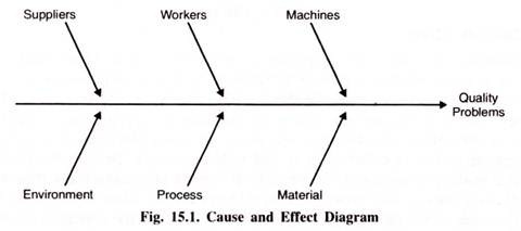
Cause-and-effect diagrams are charts that identify potential causes for particular quality problems. They are often called fishbone diagrams because they look like the bones of a fish. A general cause-and-effect diagram is shown in Fig, 15.1. The ‘head’ of the fish is the quality problem. The diagram is drawn so that the ‘spine’ of the fish connects the ‘head’ to the possible cause of the problem.
ADVERTISEMENTS:
These causes could be related to the machines, workers, measurement, suppliers, materials, and many other aspects of the production process. Each of these possible causes can then have smaller “bones” that address specific issues that relate to each cause.
For example, a problem with machines could be due to a need for adjustment, old equipment, or tooling problems. Similarly, a problem with workers could be related to lack of training, poor supervision, or fatigue.
Tool # 2. Flowchart:
A flowchart is a schematic diagram of the sequence of steps involved in an operation or process. It provides a visual tool that is easy to use and understand. By seeing the steps involved in an operation or process, everyone develops a clear picture of how the operation works and where problems could arise.
Tool # 3. Checklist:
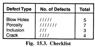
A checklist is a list of common defects and the number of observed occurrences of these defects. It is a simple yet effective quality control tool that allows the workers to collect specific information regarding the defects observed and their occurrences.
The checklist in Fig. 15.3 shows four defects of welding (while physically inspecting 10 random pieces) viz. blow holes, porosity, inclusion and crack and their occurrences (number of times they have been observed). It is clear that the biggest problem is in porosity. This means that the quality inspector should focus on this specific problem i.e., porosity and remedial action can be taken.
Tool # 4. Control Chart:
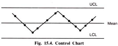
Control charts are a very important quality control tools. These charts are used to evaluate whether a process is operating within expectations relative to some measured value such as length, diameter, weight, width, or volume. For example, one can measure the length and diameter of a shaft, the width of a piece, or the volume of a bottle of soft drink etc. When the production process is operating within expectations, it is said to be in control.
ADVERTISEMENTS:
To evaluate whether or not a process is in control, the variable of interest is measured and then it is plotted on a control chart. The chart has a line down the center representing the average value of the measuring variable. Above and below the centerline are two lines, called the Upper Control Limit (UCL) and the Lower Control Limit (LCL). As long as the observed values fall within the upper and lower control limits, the process is in control and there is no problem with quality. When a measured observation falls outside of these limits, there is a problem.
Tool # 5. Scatter Diagram:
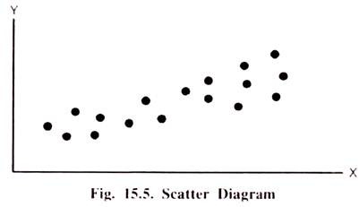
Scatter diagrams are graphs that show how two variables are related to one another. They are particularly useful in detecting the amount of correlation, or the degree of linear relationship, between two variables. A scatter diagram is composed of a horizontal axis containing the measured values of one variable (independent i.e., cause) and a vertical axis representing the measurements of the variable (dependent i.e., effect). This diagram displays the paired data as a cloud of points. The density and direction of the cloud indicate how the two variables influence each other.
For example, increased production speed and number of defects could be correlated positively; as production speed increases, so does the number of defects. Two variables could also be correlated negatively, so that an increase in one of the variables is associated with a decrease in the other. For example, increased worker training might be associated with a decrease in the number of defects observed.
ADVERTISEMENTS:
The greater the degrees of correlation, the more linear are the observations in the scatter diagram. On the other hand, the more scattered the observations in the diagram, the less correlation exists between the variables.
Tool # 6. Pare to Analysis:
Pareto analysis is a technique used to identify quality problems based on their degree of importance. The logic behind Pareto analysis is that only a few quality problems are important, whereas many others are not critical. The technique was named after Vilfredo Pareto, a nineteenth-century Italian economist who determined that only a small percentage of people controlled most of the wealth. This concept has often been called the 80-20 rule and has been extended to many areas.
In quality management the logic behind Pareto’s principle is that most quality problems are a result of only a few causes. The trick is to identify these causes. One way to use Pareto analysis is to develop a chart that ranks the causes of poor quality in decreasing order based on the percentage of defects each has caused.
ADVERTISEMENTS:
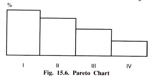
For example, a tally can be made of the number of defects that result from different causes, such as operator error, defective parts, or inaccurate machine calibrations. Percentages of defects can be computed from the tally and placed in a chart like those shown in Fig. 15.6.
Tool # 7. Histogram:
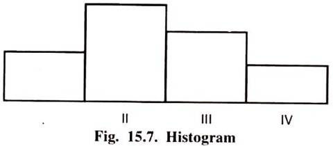
A Histogram is a bar chart/diagram showing a distribution of variable quantities or characteristics. It is a graphical display of the frequency distribution of the numerical data. The data are displayed as a series of rectangles of equal width and varying heights.
