After reading this article you will learn about:- 1. Concept of Break-Even Chart 2. Uses of Break-Even Chart 3. Construction 4. Improving Profit Performance.
Concept of Break-Even Chart (BEC):
The concept of break-even can be very well explained and analysed by break-even charts.
The chart can be used to study the changes in profit/loss at different levels of sales as well as in studying the cost profit volume relationship.
BEC is a graphical representation of sales and costs at different levels of output. It can be defined as an analysis in graphic form of the relationship of output and sales to profit.
Uses of BEC:
ADVERTISEMENTS:
BEC can be used to analyse the following situations:
(i) Profit and expenditure analysis.
(ii) Cost-volume-price relationship.
(iii) Determination of BEP. Lines representing sales turnover and total cost at different levels of output intersect each other at a point known as BEP. Beyond this point the organisation makes profit.
ADVERTISEMENTS:
(iv) Impact of variation in sales on cost of production and profits.
(v) It is a useful tool in the analysis of problems pertaining to manufacturing economics.
(vi) Profit volume and margin of safety studies.
(vii) Comparison of budget with actual sales and profits as variations in revenue or costs will result a change in the slope of the corresponding line in BEC, causing BEP to slide upwards or downwards.
ADVERTISEMENTS:
(viii) Determining optimum level of output.
Construction of BEC:
BEC is a two dimensional graph, in which level of output is taken on X-axis and the corresponding costs and revenues are taken on Y- axis. Separate curves or lines are drawn for output-total cost and output- revenue to facilitate comparison and further analysis.
A typical BEC is shown in Fig. 16.1.

The following are the steps in drawing BEC:
ADVERTISEMENTS:
(i) Determine the fixed cost, total cost and the total revenue at various levels of output.
(a) The fixed cost upto some level of output known as existing capacity of the enterprise will remain constant and will be independent of the output level. Thus the line for fixed cost will be parallel to the X- axis.
(b) It is assumed that variable cost increase in fixed proportion with increase in output. Thus the total cost curve will be a straight line and the total cost line will cut the Y-axis at a point where total cost will be equal to total revenue.
ADVERTISEMENTS:
(c) The revenue is also assumed to change in fixed proportion with corresponding change in output. Thus the revenue line can be drawn by king any two points on the graph. The line will pass through origin because hen output is zero, the revenue will also be zero.
The BEC Chart can be Studied to give the following information:
(i) It can be observed for Fig. 16.2 that the point of intersection of Revenue and total cost lines is BEP.
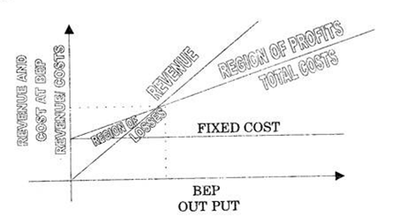
(ii) The X-coordinate corresponding to BEP denotes the level of output beyond which profits will start and below this there will be loss to the organisation.
ADVERTISEMENTS:
(iii) The Y-coordinate corresponding to BEP gives the level of break- even sales and costs.
(iv) The difference between actual sales and sales at BEP is known as ‘Margin of Safety’.
The method of drawing BEC is explained with the following example:
ADVERTISEMENTS:
Example 1:
An establishment producing only one item which it, sells at Rs. 7.50. per unit, has fixed cost equal to Rs. 40,000 and variable cost , Rs. 3.50 per unit. How many units he should produce, to Breakeven? What would be the profit if 12,000 units are produced?
Solution:
To draw sales and cost lines, we consider any two levels of output and find the corresponding revenue and total costs.
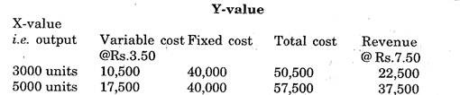
The BEC is drawn in Fig 16.3.

(i) He should produce 10,000 units for break-even.
(ii) Revenue at 13,000 units at point C=Rs.90, 000
Total at 12,000 units at point D = Rs.82, 000
Hence profit for an output of 12,000 units
= Rs 90,000 – Rs 82000 – Rs 8,000
Improving Profit Performance using Break-even Chart:
Break- even Analysis and Break-even charts are important tools for profit planning.
ADVERTISEMENTS:
There are three ways to improve profits, namely:
(i) Increasing the volume of sales i.e. revenue by (a) increase in output or(ii) increase in selling price.
(ii) Reducing the variable expenses.
(iii) Reducing the fixed expenses.
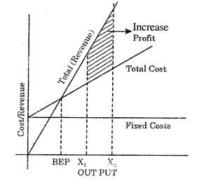
These situations can be very well analysed by BEC.
From Fig. 16.4, it can be seen that when output increases from X1, to X2 ‘ there is an increase in profit, (b) increase in selling price:
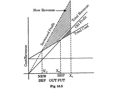
With an increase in selling price, the slope of the revenue curve will become more see Fig. (16.5). It can be seen that BEP moves to left i.e. from Xo to Xo‘ and the profits for the same output X1, increases.
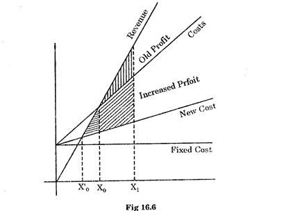
(ii) Reducing variable costs:
Decrease in variable costs reduces the slope of the cost curve (see Fig. 16.6) and there is a shift of BEP to left. Due to this margin of safety increases and the angle of incidence widens i.e. P/V ratio is improved. Here again profit for the same output X1‘ increases.
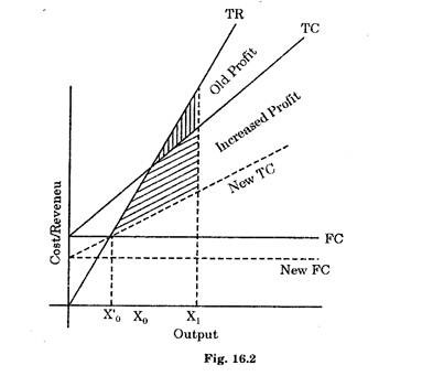
(iii) Reduction in fixed costs:
ADVERTISEMENTS:
In this case the slope of the costs curve remains the same but there is a downward shift in its position (see Fig. 16.7).
This results a shift in BEP to left i.e. from Xo to X’o. Increasing the margin of safety as well as the profits for the same level of output X1