
After reading this article you will learn about the control charts for variables and attributes.

Control Charts for Variables:
A number of samples of component coming out of the process are taken over a period of time. Each sample must be taken at random and the size of sample is generally kept as 5 but 10 to 15 units can be taken for sensitive control charts.
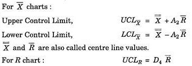
For each sample, the average value X̅ of all the measurements and the range R are calculated. The grand average X̅ (equal to the average value of all the sample average, X̅) and R (X̅ is equal to the average of all the sample ranges R) are found and from these we can calculate the control limits for the X̅ and R charts.
ADVERTISEMENTS:
Therefore,
LCLR = D3 R̅
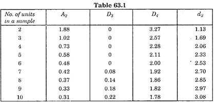
Here the factors A2, D4 and D3 depend on the number of units per sample. Larger the number, the close the limits. The value of the factors A2, D4 and D3 can be obtained from Statistical Quality Control tables. However for ready reference these are given below in tabular form.
ADVERTISEMENTS:
As long as X and it values for each sample are within the control limits, the process is said to be in statistical control.

where d2 is a factor, whose value depends on number of units in a sample. Its value is seen from S.Q.C. Tables 63.1.
Process Out of Control:
After computing the control limits, the next step is to determine whether the process is in statistical control or not. If not, it means there is external causes that throws the process out of control. This cause must be traced and removed so that the process may return to operate under stable statistical conditions.
ADVERTISEMENTS:
The various reasons for the process being out of control may be:
(i) Faulty tools,
(ii) Sudden significant change in properties of new materials in a new consignment,
(iii) Breakdown of lubrication system,
ADVERTISEMENTS:
(iv) Faults in timing of speed mechanisms etc.
Tracing of these causes is sometimes simple and straight forward but when the process is subject to the combined effect of several external causes, then it may be lengthy and complicated business.
Process in Control:
If the process is found to be in statistical control, a comparison between the required specifications and the process capability may be carried out to determine whether the two are compatible. Should the specified tolerances prove to be too tight for the process capability?
ADVERTISEMENTS:
There are three possible alternatives:
(a) Re-evaluate the specifications. Whether the tight tolerances are actually needed or they can be relaxed without affecting quality.
(b) If relaxation in specifications is not allowed then a more accurate process is required to be selected.
ADVERTISEMENTS:
(c) If both the above alternatives are not acceptable then 100% inspection is carried out to trace out the defectives.
Conclusions:
When the process is not in control then the point fall outside the control limits on either X or R charts. It means assignable causes (human controlled causes) are present in the process. When all the points are inside the control limits even then we cannot definitely say that no assignable cause is present but it is not economical to trace the cause. No statistical test can be applied.
Even in the best manufacturing process, certain errors may develop and that constitute the assignable causes but no statistical action can be taken. This leads to many practical difficulties regarding what relationship show satisfactory control.
ADVERTISEMENTS:
One of the most common causes of lack of control is shift in the mean X. X chart is also useful for the purpose of detecting shift in production. Tool wear and resetting of machines often account for such a shift. It is necessary to find out when machine resetting becomes desirable, bearing in mind that too frequent adjustments are a serious setback to production output.
Fig. 63.1 snows few examples of X charts. The charts a, b and c shows the relation between the process variability and the specifications. The Fourth illustrates that there is an adequate process from the point of view of the specifications but there is constant shift in X It means periodic resetting of machine is needed to bring down the value of X to the control limits, if the original conditions are to be regained.
Therefore, it can be said that the problem of resetting is closely associated with the relationship between process capability and the specifications. Case (a) in Fig. 63.1 would require a smaller number of machine resets than case (b).
This can further be illustrated in Fig. 63.2. In case (a) the mean X can shift a great deal on either side without causing a remarkable increase in the amount of defective items. In case (b) the process capability is compatible with specified limits. In case (c) the process spared + 3a is slightly wider than the specified tolerance so that the amount of defectives (scrap) become quite large whenever there is even a small shift in X. This needs frequent adjustments.
To illustrate how x and r charts are used in process control, few examples are worked out as under.


Example 1:
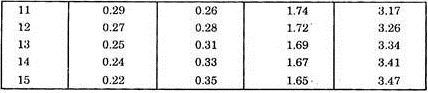
The table 63.2 give record of 5 measurements per sample from lot size of 50 for the critical dimension of jeep valve stem diameter taken every hour, (i) Compare the control limits, make plot and explain plotting procedure, (ii) Interpret plot, make decision regarding quality of product, process control and cost of inspection.

From S.Q.C. table 63.1 the values of A2, D4 and D3 can be recorded from the 5 measurement sample column.
A2 = 0.58
and
ADVERTISEMENTS:
D3 = 0
D4 = 2.11.
Now charts for X̅ and R are plotted as shown in Fig. 65.3 taking abscissa as sample number and ordinate as X̅ and R. X̅ and R charts must be drawn one over the other as shown, i.e. R chart must be exactly under X̅ chart.
What the X̅ and R charts tell?
Sometimes X̅ chart does not give satisfactory results. This may occur due to old machine, or worn out parts or misalignment or where processing is inherently quite variable. Here the “Range” chart is used as an additional tool to control.
ADVERTISEMENTS:
The purpose of this chart is to have constant check over the variability of the process. Process variability demonstrated in the figure shows that though the mean or average of the process may be perfectly centred about the specified dimension, excessive variability will result in poor quality products.
The use of R-chart is called for, if after using the X̅ charts, it is found that it frequently fails to indicate trouble promptly.
The R-chart does not replace the X̅ -chart but simply supplements with additional information about the production process.
The R-chart is also used for high precision process whose variability must be carefully held within prescribed limits. Similarly many electro-chemical processes such as plating, and micro chemical biological production, such as fermentation of yeast and penicillin require the use of R- chart because unusual variability is quite inherent in such process.

Example 2:
ADVERTISEMENTS:
The following record taken for a sample of 5 pieces from a process each hour for a period of 24 hours.


Now X̅ and R charts are plotted on the plot as shown in Fig. 63.4 taking abscissa as sample number and ordinates as X̅ and R respectively.
ADVERTISEMENTS:
Inference:
Let us look at the Fig. 63.4.
In the ![]() chart, most of the time the plotted points representing average are well within the control limits but in samples 10 and 17, the plotted points fall outside the control limits.
chart, most of the time the plotted points representing average are well within the control limits but in samples 10 and 17, the plotted points fall outside the control limits.

It means something has probably gone wrong or is about to go wrong with the process and a check is needed to prevent the appearance of defective products.
If the cause has been eliminated, the following plotted points will stay well within the control limits, but if more points fall outside the control limits then a very thorough investigation should be made, even if it is necessary to shut down production temporarily until everything is adjusted again and no more points fall outside.
Control Charts for Attributes:
The X̅ and R control charts are applicable for quality characteristics which are measured directly, i.e., for variables. There are instances in industrial practice where direct measurements are not required or possible.
Under such circumstances, the inspection results are based on the classification of products as being defective or not defective, acceptable as good or bad accordingly as that product confirms or fails to confirm the specified specification.
In manufacturing, sometime it is required to control burns, cracks, voids, dents, scratches, missing and wrong components, rust etc. Here, we inspect products only as good or bad but not how much good or how much bad. Furthermore, there are many quality characteristics that come under the category of measurable variables but direct measurement is not taken for reasons of economy.
These products are inspected with GO and NOT GO gauges. Again under this type also, our aim is to tell that whether product confirms or does not confirm to the specified values. Quality characteristics expressed in this way are known as attributes.
The various control charts for attributes are explained as under:
1. Attribute Charts for Defective Items: (P-Chart):
This is the control chart for percent defectives or for fraction defectives. This is used whenever the quality characteristics are expressed as the number of units confirming or not confirming to the specified specifications either by visual inspection or by ‘GO’ and ‘NOT GO’ gauges.
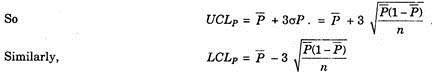
The Centre Line Value:
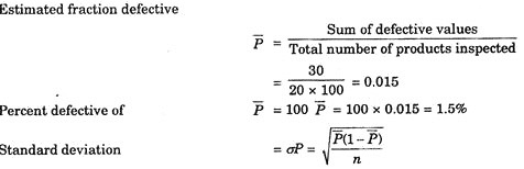
It is denoted by P̅ (P bar) and may be defined as the ratio between the total number of defective (non-conforming) products observed in all the samples combined and the total number of products inspected. For example, 15 products are found to be defective in a sample of 200, then 15/200 is the value of P̅.
Fraction and Percent Defectives:
The fraction defective value is represented in a decimal as proportion of defectives out of one product, while percent defective is the fraction defective value expressed as percentage. As in the above example, fraction defective of 15/200 = 0.075, and percent defective will be 0.075 x 100 = 7.5%.
Standard Deviation:
The standard deviation for fraction defective denoted by σ P is calculated by the formula.
![]()
where n = sample size and P̅ = fraction defective.
Trial Control Limits:
Just as the control limits for the X and R-charts are obtained as + 3σ values above the average. The two control limits, upper and lower for this chart are also calculated by simply adding or subtracting 3σ values from centre line value. These trial limits are computed to determine whether a process is in statistical control or not.
Mostly the control limits are obtained on the basis of about 20-25 samples to pick up the problem and standard deviation from the samples is calculated for further production control.
Example 3:
The table shows that successive lots of spindle are coming out of the machine. The spindles are subject to inspection for burrs. The spindles are inspected in samples of 100 each.
Presence of a single or more burrs discriminates the value to be as defective. Compute and construct the chart.

Computation and Construction:
Here the maximum percent defective is 7% and the total number of samples inspected is 20. On graph paper, make abscissa for samples number 1, 2, 3, up to 20. Make ordinate as percent defective so as to accommodate 7%. Next go on marking various points as shown by the table as sample number vs. percent defective.
Draw three firm horizontal lines, one each for central line value, upper limit and lower limit after obtaining by calculations.


Variable Sample Size:
Now consider an example of a P-chart for variable sample size. This is because, hourly, daily or weekly production somewhat varies. Therefore, it is not always feasible to take the samples of constant sizes.
Such problems can be solved as under:
Example 4:

Here the average sample size will be = 900/10 = 90
It is a common practice to apply single control limits as long as sample size varies ± 20% of the average sample size, i.e., ± 20% of 90 will be 72 and 108. Therefore, mark the samples with ɸ which are below 72 and above 108.
P̅ the fraction defective = 21/900 = 0.023
As the samples on dates 12, 16, 17, 18, 19 and 20 are covered within ± 20% of the averages, we have now the following sample sizes for which control limits are to be calculated separately.

2. Attribute Charts for Number of Defects per Unit: (C-Chart):
This is a method of plotting attribute characteristics. In this case, the sample taken is a single unit, such as length, breadth and area or a fixed time etc. In some cases it is required to find the number of defects per unit rather than the percent defective.
For example take a case in which a large number of small components form a large unit, say a car or transistor. The transistor set may have defect at various points. In this case, it seems natural to count the number of defects per set, rather than to determine all points at which the unit is defective.
This attempt to use P-charts to locate all the points at which transistor is defective seems to be wrong, impossible to some extent and impracticable approach to the problems. Such a condition warrants the necessity for the use of a C-chart.
Examples of C-Chart:
The distribution of the variables in C-chart very closely follows the Poisson’s distribution.
The examples given below show some of representative types of defects, following Poisson’s distribution where C-chart technique can be effectively applied:
(i) Number of blemishes per 100 square metres.
(ii) Typing mistakes on the part of a typist.
(iii) Number of spots on a distempered wall.
(iv) Air gap between two meshing parts of a joint.
(v) Welding defects in a truss.
(vi) Unweaven points on a piece of a textile cloth.
(vii) Leakage in water tight joints of radiator.
(i) The Average Number of Defects:
It is denoted by C̅ (C bar) and is the ratio between the total number of defects found in all samples and the total number of samples inspected.
(ii) Standard Deviation:
The sigma of standard deviation for number of defects per unit production is calculated from the formula σc = ![]()
Trial Control Limits:
The control limits can be calculated as ± 3σc from the central line value C.
i.e., UCLc = C̅ + 3![]()
LCLc = C̅ – 3![]()
Example 5:
The following table shows the number of defects on the surface of bus bodies in a bus depot, on 21 Sept. 2013.

Computation:
(i) Compute the average number of defects C̅ = 110/20 = 5.5.
(ii) Compute the trial control limits, UCLc = 5.5 + 3 ![]() = 12.54
= 12.54
LCLc = 5.5 – 3 ![]() = – 1 .74 = 0, as -ve defects are not possible.
= – 1 .74 = 0, as -ve defects are not possible.
Construction:
1. Mark abscissa as the body number to a suitable scale (1 to 20).
2. Mark ordinate as number of defects say upto 15. Looking to the table, the maximum number of 14 defects are in body No. 8.
3. Mark various points for the body number and the number of defects in that body.
4. Join all the 20 points with straight lines and also draw one line each for average control line value, upper control limit and lower control limit, i.e. 5.5, 12.54 and 0 respectively.
Interpretation:
As shown in the chart, one point No. 8 having 14 defects fall outside the upper control limit. The data relate to the production on 21/5/2014. then C̅ value requires recalculation which will be 100 + 14/19 = 5.03. The value 5.03 will be the standard value of C̅ for next day’s production. Consequently the control limits are also revised if it decided to apply the data in next day’s production, i.e., 22/5/2014.
